Description
Rob Hanna – Quantifiable Edges – Gold Subscription
Quantifiable Edges has been publishing quantitative research, systems, and trading ideas since 2008. We utilize technical analysis concepts and quantify them in a way that allows traders to determine the edge that was provided in the past. Breadth, volume, sentiment, volatility, Fed-induced liquidity, seasonality, and price action are all used to assess market conditions. Gold and Silver level subscribers are led through Rob Hanna’s interpretation of the data in a simple and complete manner via the nightly and weekly subscriber letters. Gold subscribers also have complete access to our subscriber area, which includes the Quantifinder, custom charts, trading systems (with code), special research, and more.
Both private and institutional traders have taken advantage of the vast tools and studies that have been developed over the years. Some of the most popular indicators include the Quantifiable Edges Capitulative Breadth Indicator (CBI) and the Aggregator. Quantified research related to Fed policy and action around Fed Days is available. Subscribers also have access to the full archive of letters back to 2008, which include thousands of original studies.
Additionally, Quantifiable Edges provides unique courses for longer-time market timing and quant-based swing trading. Both self-paced courses include detailed market research, and show traders how to take advantage of it. They also come with supporting software for those traders interested in furthering the research and ideas on their own.
And for traders that are interested in mechanical trading strategies, the Quantifiable Edges ETF Momentum Swing Portfolio provides nightly signals, while the Quantifiable Edges Big Time Swing System is an open-coded, robust, non-optimized trading system that can be traded as-is or used as a base for traders to adapt into their own system.
Beginner, advanced, and institutional traders have all taken advantage of the research, teachings, and tools provided by Quantifiable Edges since 2008. Free trials to the gold subscription service are offered with just name and email required. You may follow Quantifiable Edges on Twitter (@QuantifiablEdgs), Facebook, LinkedIn, or receive blog posts and updates from Quantifiable Edges directly to your email.
Quantifiable Edges Recent Posts
View All
Looking at 7-day Win Streaks
Posted on August 11, 2020 by Rob Hanna
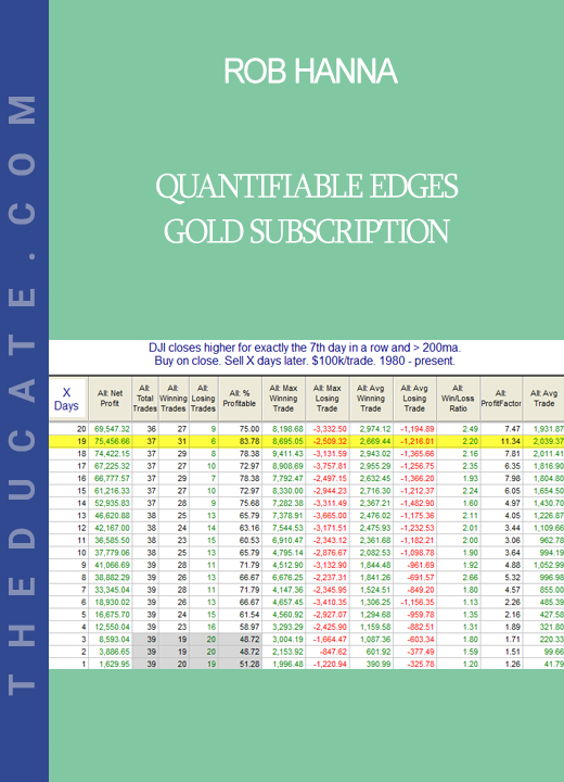
The recent rally has left the market short-term overbought by most measures. Short-term overbought often triggers some studies that suggest a downside edge, but when the overbought condition gets very strongly overbought, then those downside edges often disappear. And at some point, rather than strength leading to weakness, the strength will beget more strength. The strong move higher over the last several days has turned the market so overbought that we are seeing this scenario begin to unfold. The study below looks at the 7-day win streak in the Dow Jones Industrial average. It exemplifies this concept.
Performance after 7 up closes for DJI. Bullish.
There is not much of an edge over the 1st few days. But once you get out a little further, the stats appear solidly bullish. Below is a look at the profit curve assuming a 19-day holding period.
7 up days. 19-day later profit curve
The strong move from lower left to upper right appears to offer some confirmation of the bullish tendency. In last night’s subscriber letter, I also looked at the same setup with SPX, since SPX has also posted 7 higher closes. Results were very similar. Short-term momentum has been so strong recently that it appears likely to carry through some on an intermediate-term basis.
Want research like this delivered directly to your inbox on a timely basis? Sign up for the Quantifiable Edges Email List.
My NAAIM Webinar…
Posted on July 22, 2020 by Rob Hanna
Last week I had the honor of being a guest speaker for the National Association of Active Investment Managers (NAAIM)) webinar series. The topic I discussed was “Quantifiable Edges for Active Investing”. That recording is now available to view on the NAAIM website (email registration required). And if you are an investment manager, you may also want to learn more about NAAIM.
SPX Golden Cross History Since 1928
Posted on July 9, 2020 by Rob Hanna
SPX will post a Golden Cross on Thursday afternoon. A Golden Cross occurs when the 50ma crosses over the 200ma. Having the 50ma above the 200ma is commonly considered a bullish market condition – and generally it is. In the 4/2/19 blog post I looked at SPX Golden Crosses dating all the way back to 12/31/1928. I have updated that research tonight with Amibroker Software and Norgate Data. Below is a list of all Golden Crosses since then. (Note that prior to 1957, S&P 90 data was used. The S&P 90 is considered the predecessor to the S&P 500.)
SPX Golden Cross results since 1928
The most recent Golden Cross formation got slammed by the March COVID crash. But since the 1961 trigger, the Golden Cross has generally served as a fairly good timing device to sidestep large portions of bear markets. Prior to that it was not nearly as effective. This can be seen in the drawdown chart below. (Note: Overnight Fed Funds rate was used to calculate nightly interest starting in July 1954, which is as far back as my data goes. Prior to that, no interest rate was assumed when out of the market.)
GET Rob Hanna – Quantifiable Edges – Gold Subscription download
While drawdowns have been mostly fairly moderate since the mid-50s, prior to that there were some very large drawdown to endure. Of course, the 2020 drawdown is the biggest since 1940 – and we still have a good ways to go for the system to dig out of it. Despite some fairly sizable drawdowns, the Golden Cross would have beaten “Buy and Hold” handily. It is a bullish long-term trend indication. But it is not a bulletproof long signal.
Want research like this delivered directly to your inbox on a timely basis? Sign up for the Quantifiable Edges Email List.
First Day of Month Based on Month
Posted on July 1, 2020 by Rob Hanna
Since the late 80s there has been a tendency for the market to rally on the first day of the month. One theory on why this occurs is that there are often 401k inflows that are put to work on the 1st of the month. I examined this tendency and broke it down by month on the blog in 2013 and 2009. I thought it would be interesting to take another look at it today. Below is an updated version of the study.
SPX 1st day of month broken down by month
July has been the most reliable month in term of closing positive. And when looking at the size of the average gain, it comes in 2nd. You also note that August is the worst on both counts.
Want research like this delivered directly to your inbox on a timely basis? Sign up for the Quantifiable Edges Email List.
What Friday’s Action Suggests About Short-Term Volatility
Posted on June 15, 2020 by Rob Hanna
It was unusual on Friday to see such large opening gap (+2.54%) filled, and then SPY still managed to close positive. This can be seen in the study below, which I showed in the subscriber letter over the weekend.
SPY 2% Gaps Up that fill and then close positive.
Four instances closed higher, and 6 closed lower over the next 2 days. So there does not appear to be a strong directional bias. But the takeaway is that the volatility did not just disappear. At the bottom you’ll see I circled stats looking at avg “run-up + 1 standard deviation” and avg drawdown – 1 std deviation”. What those mean is that it would not be unusual to see the market rise as much as 6% or decline as much as 9% over the next couple of days. That is a huge spread for a 2-day time span. It speaks to the potential risk of being wrong.
Proof Content


Reviews
There are no reviews yet.